One of the most iconic looks for Cortex games is the “trait halo” character images where a character portrait is ringed by a thin-lined circle studded with dice. To make these really pop, some portions of the character portrait go over the circle while other elements are bound within the circle.
Art by Anna Griffin
Reproducing this look can be a little daunting for folks who aren’t experienced graphic designers, but it’s actually a relatively simple application of layers and masks. This tutorial will give you step-by-step instructions on how to pull it off.
I use Affinity Photo, part of the superlative Affinity Suite by Serif. You can follow the same steps in Photoshop, GIMP, or Inkscape, though. The menu options will be in different places, but the fundamentals are the same.
The first thing to understand in this composition is Layers. Basically imagine that your image is made up of a stack of transparent sheets. Each sheet can have an image on it, and where there isn’t image, you can see through to the lower layers. We need three primary layers: one for the Halo, one for the Art, and one for the Background.

I rarely actually name my layers when I’m working with images I’m not doing tutorials for, but it is a good practice to get into. Just click on the default name (usually “(Group)” or “Pixel”) and name it something clear… like Halo, Art, and Background.
My default setup is to paste content into the first two layers. I paste into the Halo layer an Affinity Designer object that has the ring and the dice as glyphs using the Cortex Symbology font (linked below). Then I paste the art into the Art layer. Lastly I throw a simple gradient into the Background layer. (Gradients are magic for making things look snazzy with very little effort.)
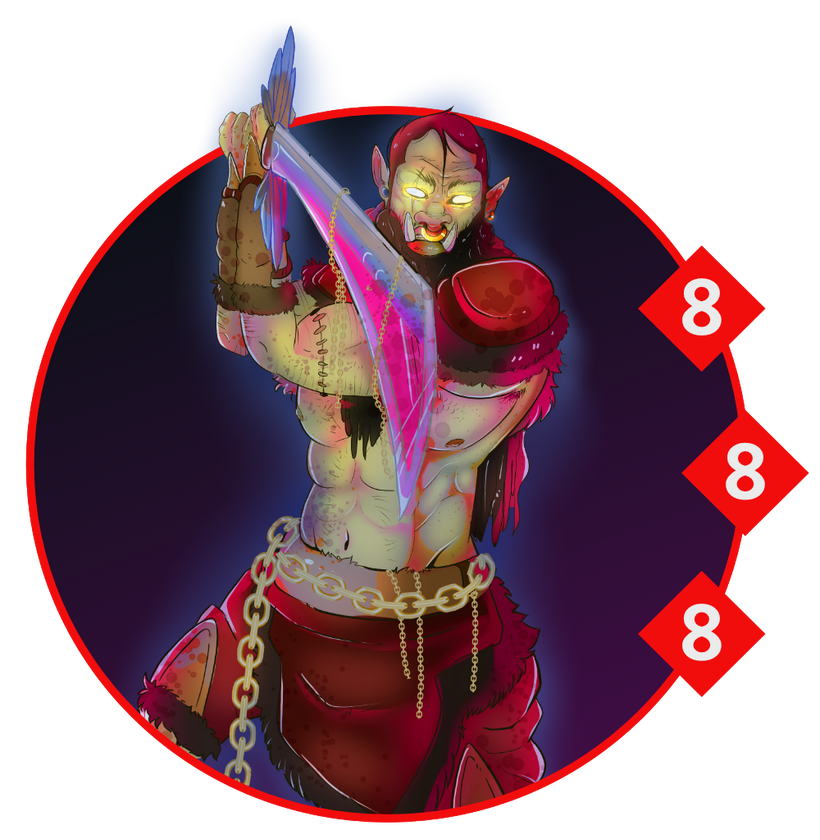
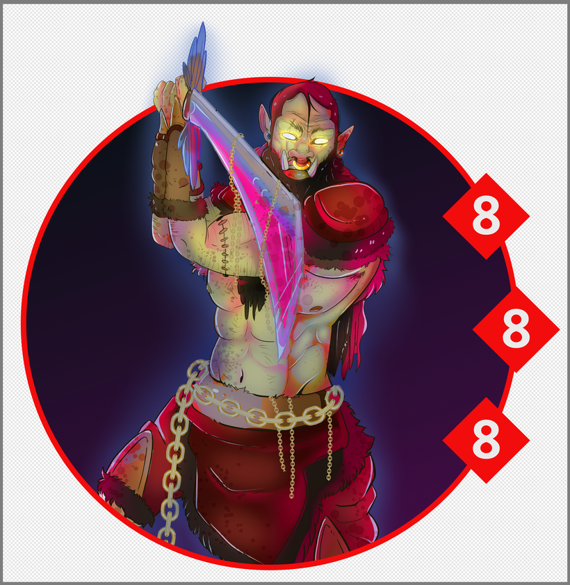
That will get something like this:
The halo goes right over the ork’s sword. The background is both inside and outside the halo. For most art pieces, you’d also see the ork’s legs beneath the halo, but Anna did this piece with the halo in mind, so he’s pre-cropped.
This isn’t what we want the finished product to look like, but we can move things around, resize the art in relation to the halo, and a number of other adjustments. Get things placed how you like them before we proceed to the next step.
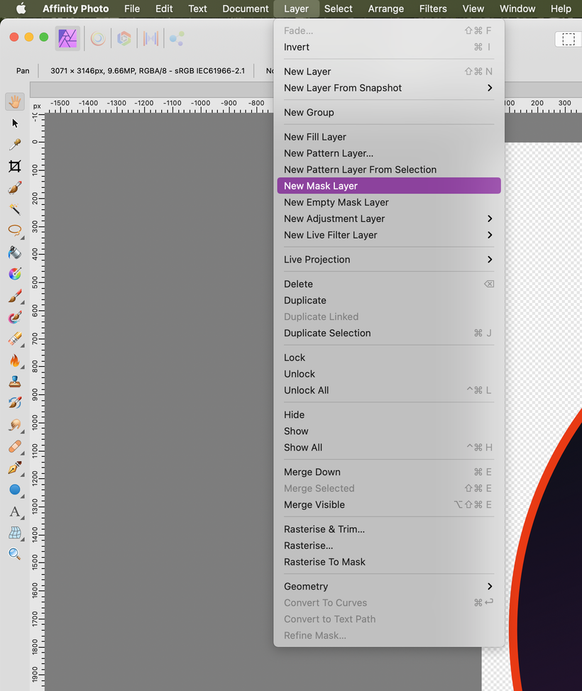
To make the layers work together, we’re going to apply some masks. A mask is a sublayer attached to one of our primary layers. It’s basically just white and black pixels. Where there’s white pixels in the mask layer, we can see the primary layer. Where there’s black pixels in the mask layer, we can’t see the primary layer. This essentially lets us block out portions of the halo, art, or background without actually deleting anything.
Select each layer (Halo, Art, and Background) and select New Empty Mask Layer. That will get you an all-white show-everything Mask layer. Then you can select that mask and use the eraser or a black brush to remove portions of its primary layer. In the case of our ork here, we’d paint black on the halo’s mask along the upper edge where the sword goes ‘out’ over the halo. If the ork had longer legs, we could paint black on the art’s mask to remove the lower legs that get chopped off by the halo’s ring.
If you want to put a halo around the head of a full-body portrait—like the Engineer sample character in the Corebook—you can paint black on the halo’s mask where the halo overlaps their neck/shoulders/torso.
You can also select some portion of the canvas (using the marquee or the lasso or whatever) and select New Mask Layer. That will give you a mask layer where everything within your current selection is white and visible and everything outside your selection is black and hidden. This is especially useful for the background: use the circular marquee to select the pixels within the halo, select the Background layer, and then hit New Mask Layer.
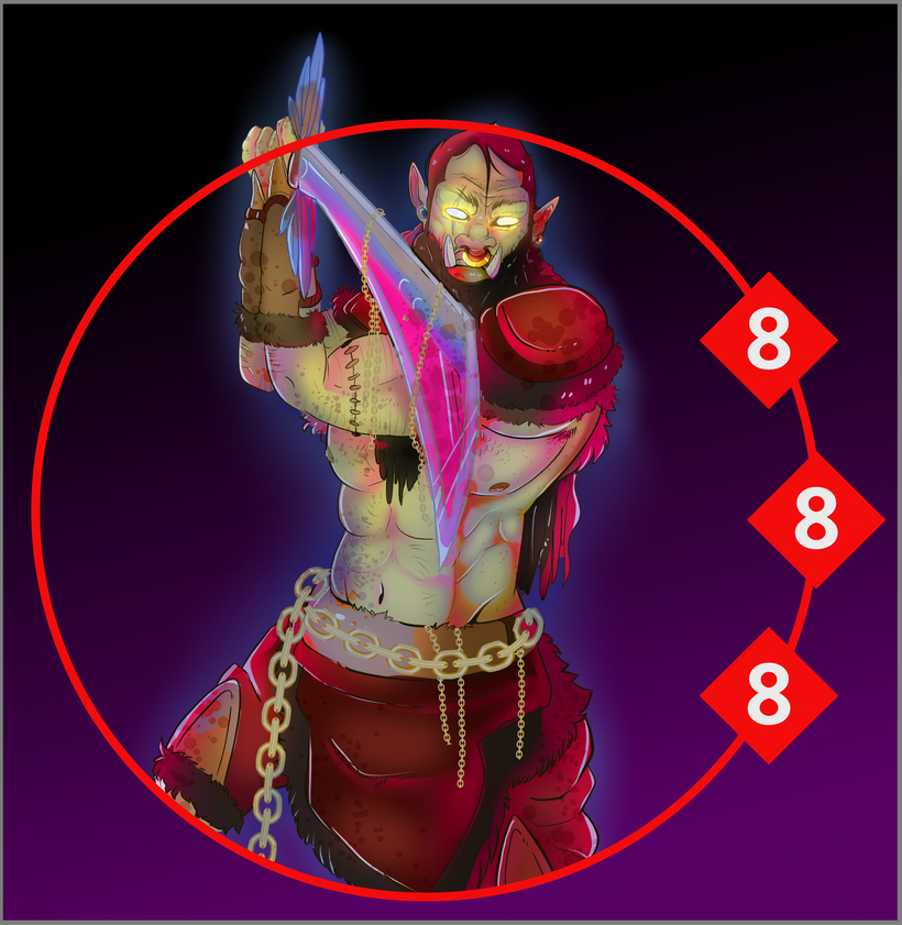
Once the masks are applied, we have our desired composition:
If things don’t look quite right, you can still move the art and background around. If you select the pixels of the background (not the whole layer), you can move the gradient around while keeping the mask in the same place. Moving the art around is more difficult, since you can’t move the Halo layer’s mask at the same time: the portions where the art pops over the halo will go out of alignment. You can try to select the pixels in the mask and move that back into alignment with the art, or you can just erase the pixels that aren’t quite right and do them over again.
Once everything looks right, you can then export the file to PNG or any other transparency-supporting format for placement in your document or website. That’s it, you’ve made a trait halo character portrait!
If you are using Affinity, I’ve attached my template that I use for compositing trait halos and character art. There’s a few extra tricks you can employ if you’re using this file.
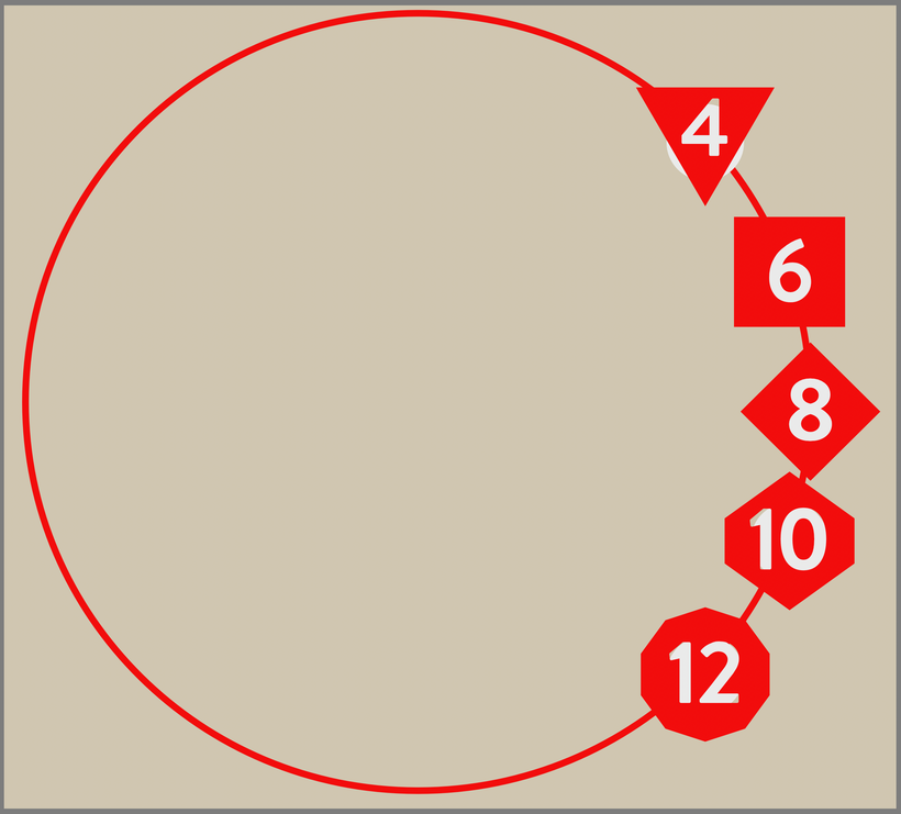
When you start a new composition with this template, it comes up with each of the five dice glyphs along the halo. If you’re making a Mob or Boss (or Crisis Pool), you’ll only want one of those glyphs repeated a couple of times. Just select the one you do want (selecting the Art Text layer in the layers panel and then selecting the text inside the text box), copy it, and then paste it into the other art text objects. Delete the dice you don’t need (by selecting that die’s group).
(You might also notice that the white circle backing the dice is a little off for the d4 and d10. If you’re using those dice, you’ll need to select the circle and move or expand it. By default it’s the right size and shape for the dice that get used most often, d6 and d8.)
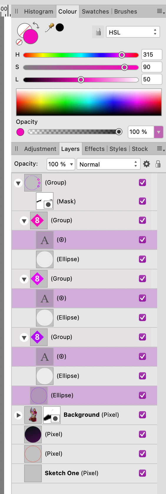
Because the ellipse and dice are Designer objects dropped into the Photo composition, you can adjust their colors within Affinity Photo. Select the art text layer to change the die’s color; select the white ellipse backing to change the color of the number on the die. The dice glyphs don’t have a stroke by default, but you can add one if you like. You can also adjust the stroke width of the ellipse if you want a thicker (or thinner) halo. You can fiddle with these options endlessly to produce some really eye-catching variations.

I’ve attached both the Affinity Photo template as well as the font the template uses, which you can download below.
Otherwise, that’s it! That’s the tutorial, that’s how I make these lovely trait halo portraits. If this tutorial and/or template has been helpful for you, please consider becoming a patron! Regardless, though, have fun making cool Cortex stuff!
—Josh